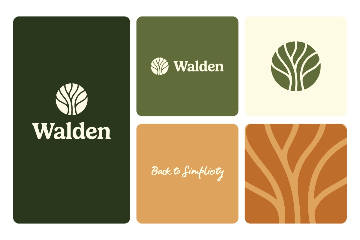
Walden
Reimagining a beloved bookstore as a multi-touchpoint brand ecosystem. Where nature, simplicity and human experience converge.
Client
Industry
Year
My Role

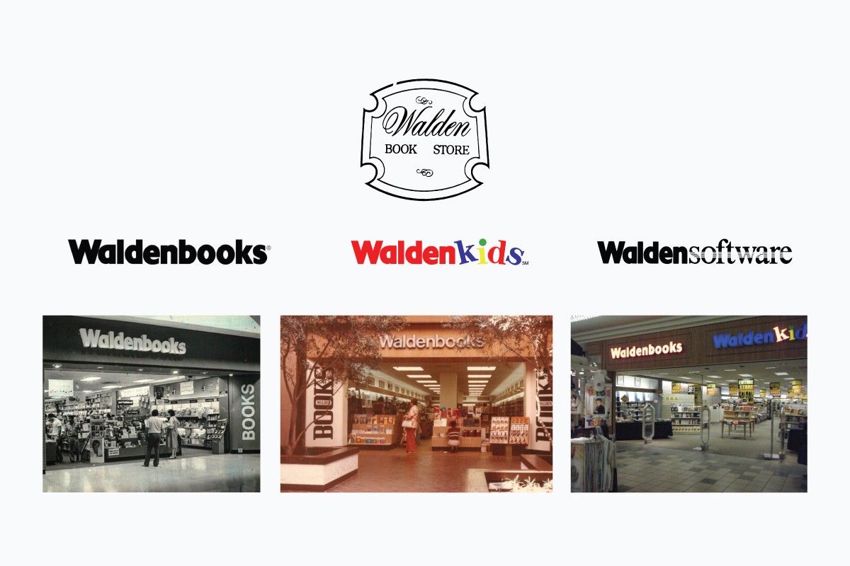
Waldenbooks was once one of the largest bookstore chains in the United States. Founded in 1933, it made books widely accessible across America, until it couldn't keep up. By 2011, it had closed entirely, unable to compete with big-box retailers and the rise of e-commerce.
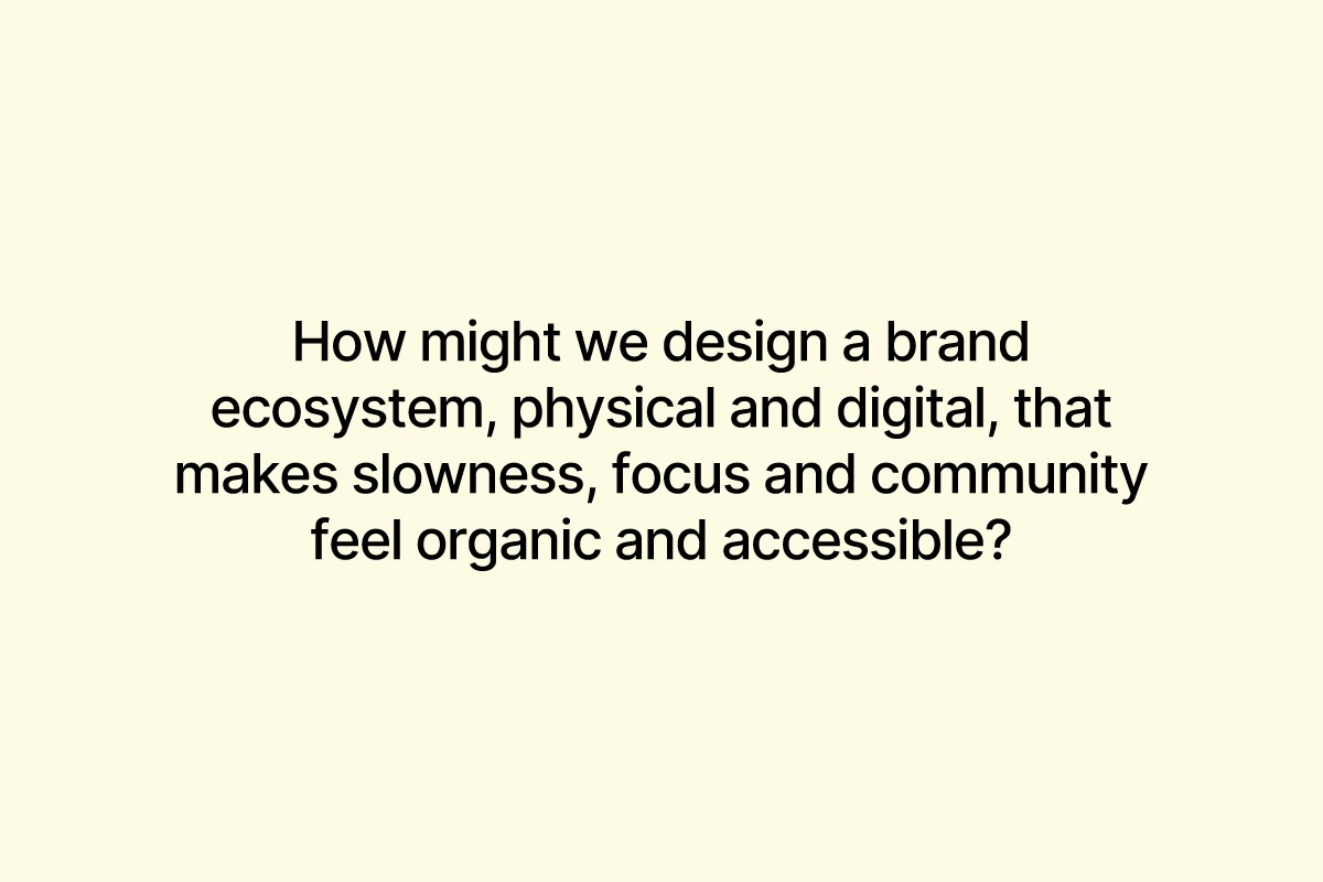
The Brief: Don't just bring it back. Reimagine it for a generation that is overwhelmed by screens, starved of focus and quietly searching for spaces that feel human.
THE PROBLEM
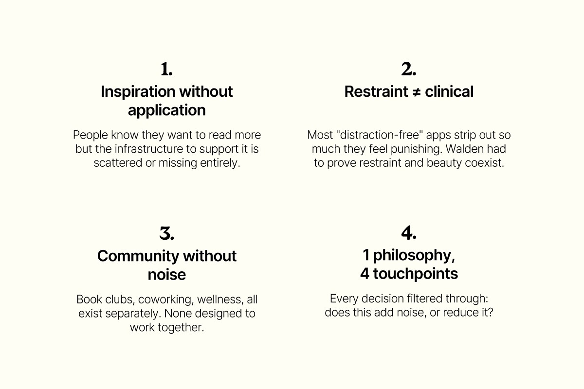
People are not reading less because they love books less. They're reading less because nothing is designed to help them slow down.
THE USER
Urban professional or student, 22-35. Overstimulated by screens, craving culture and community.
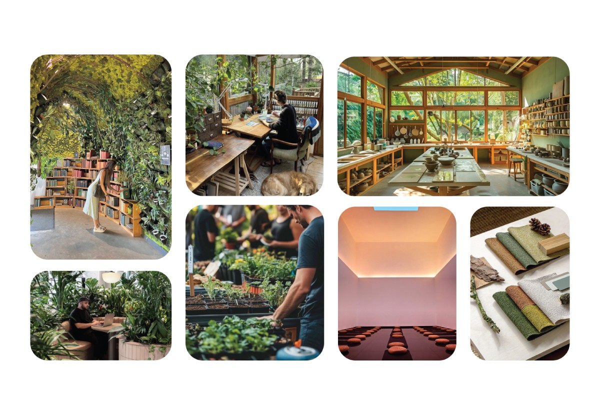
DESIGN INSIGHTS
THE EXPERIENCE SYSTEM
Walden goes beyond a bookstore. It is a sanctuary, designed across 4 connected touchpoints that each reinforce a single philosophy: Back to Simplicity.

EXPERIENCE DESIGN PROCESS
The most important design decision on this project was treating all four touchpoints as one system, not 4 separate deliverables.
The brand identity informed the spatial palette. Warm earth tones, natural textures and generous white space. The spatial philosophy informed the app's interaction model with no notifications, no gamification and no dark patterns. The app's personalization logic informed the website's subscription flow, to meet users where they are, reduce friction and don't oversell.
THE WALDEN EXPERIENCE
Brand Identity: The visual and tonal language that holds everything together
Mobile App: Browse books, join book clubs, manage your membership, all in a distraction-free environment
Website: Discover Walden, explore co-working memberships and find your nearest location.
Physical Space: Reading nooks, wellness workshops, a lobby designed for decompression
MOBILE APP
Browse and purchase books.
Join book clubs & attend events.
Manage your Walden membership.
Personalized Onboarding:
The app opens with a question: What are you hoping to get out of Walden?
Users select their interests from reading, focus, community, wellness, and the app builds their experience around those choices.
Key Design Decision: No algorithmic feed
Most apps surface content based on what keeps you engaged. Walden surfaces content based on what you said you cared about when you signed up.
Key Design Decision: The app mirrors the space
Every visual choice in the app from the color temperature, the spacing, the absence of bottom-tab badges and red notification dots, was made to feel like stepping into the physical Walden. If the space is calm, the app should be calm.
THE WEBSITE EXPERIENCE
Browse co-working space offerings (seating types, amenities).
Subscription-based model for access.
Locate the nearest Walden location.
The design priority was clarity over completeness. Rather than trying to explain everything Walden offers on the homepage, the site is structured to answer the one question most first-time visitors have: Is this a place for me?
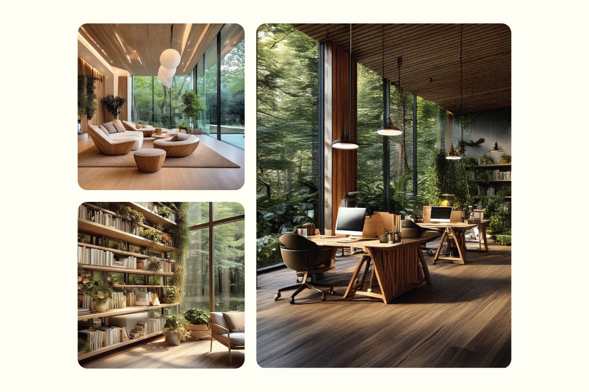
SPACE VISUALIZATION
The physical space was visualized using AI-generated imagery (Adobe Firefly, Photoshop) to communicate the spatial philosophy. The design language: natural materials, diffused light, generous seat spacing, shelving that invites browsing rather than directing it.
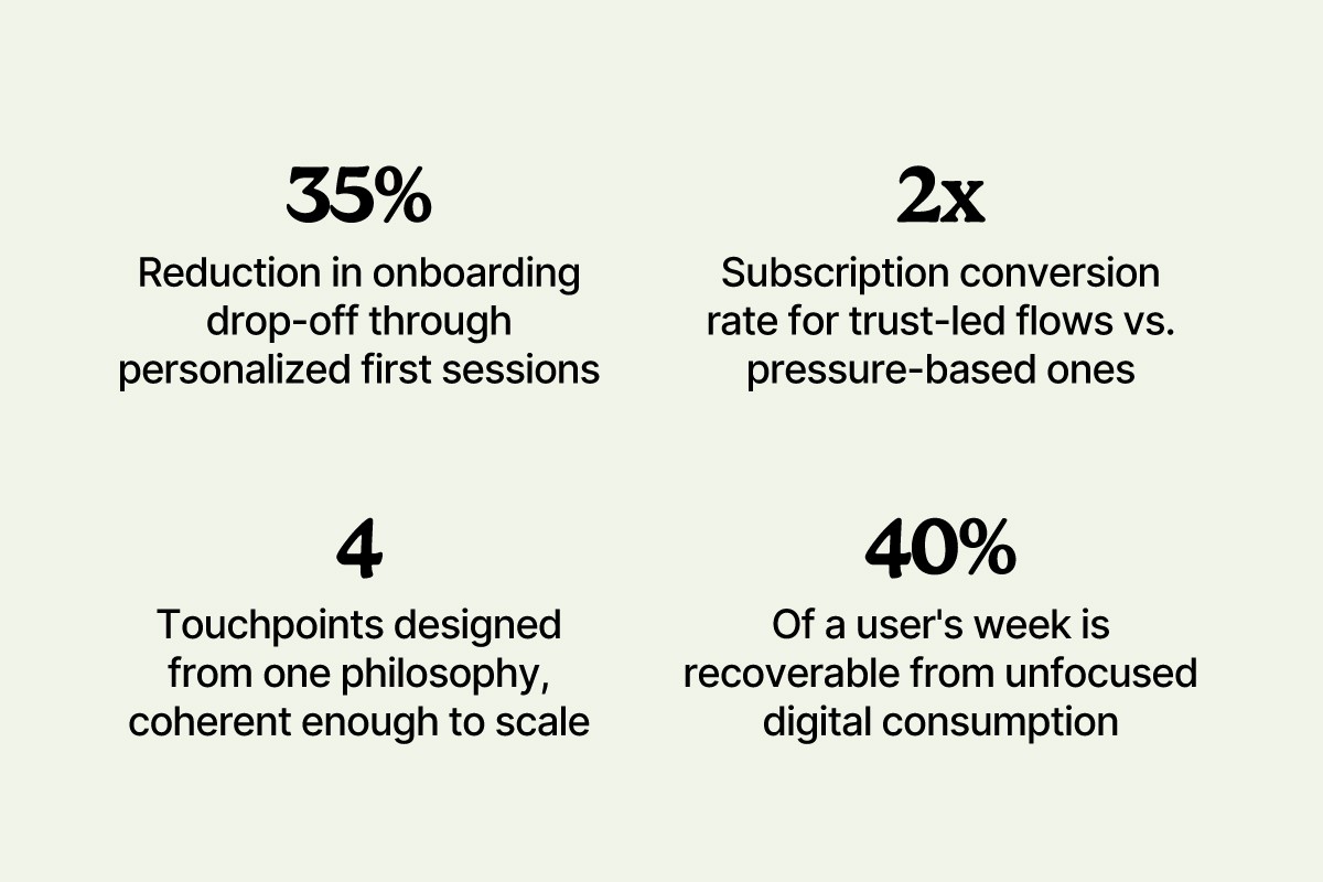
PROJECTED IMPACT